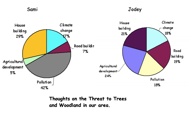
A full lesson plan with starter, main and plenary activities. Construction and comparison of pie charts as well as gaining understanding from graphs and data.
Once that’s done you’ll be able to experience the CensusAtSchool website perfectly.
A full lesson plan with starter, main and plenary activities. Construction and comparison of pie charts as well as gaining understanding from graphs and data.
What is the best way to construct a graph from data that is ranked? This worksheet explores how to graph the data using pie charts and stacked bar charts.
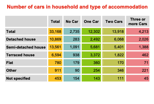
Comparing National Statistic data to CensusAtSchool data on car ownership and traffic. Interpretation, line graphs, and in the extension task, comparative bar charts.
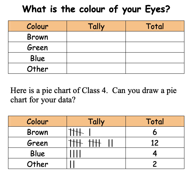
Simple worksheet, with very few words, encouraging pupils to draw simple tables and graphs. This one is about eye colour.
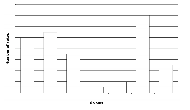
Not as easy as it first appears. Some real mathematical thinking needed here. Clues are given for students to determine labels and scales on bar charts.
An Excel sheet and Word document explaining stratified sampling.
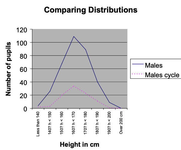
Comparing boys height with cycling to school.
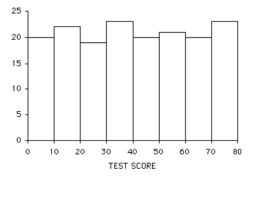
Pupils are asked to sort out 20 histograms onto groups and try to identify the characteristics of each group. Great for really embedding the concept of differing types of distribution.
Using the CensusAtSchool project as a tool in delivering data handling in the classroom.
The aim of this lesson was to:
Students had previously struggled with analysing data and producing graphs (in particular pie charts) so the objective of this activity was to allow pupils to focus on interpreting data and graphs effectively, whilst allowing ICT to do the ‘hard’ work for them.
Some pointers: